In Counter-Strike 2, the most prestigious competition is the Major. Organized under the patronage of the game’s developer and publisher, Valve, it gathers the best teams in the world.
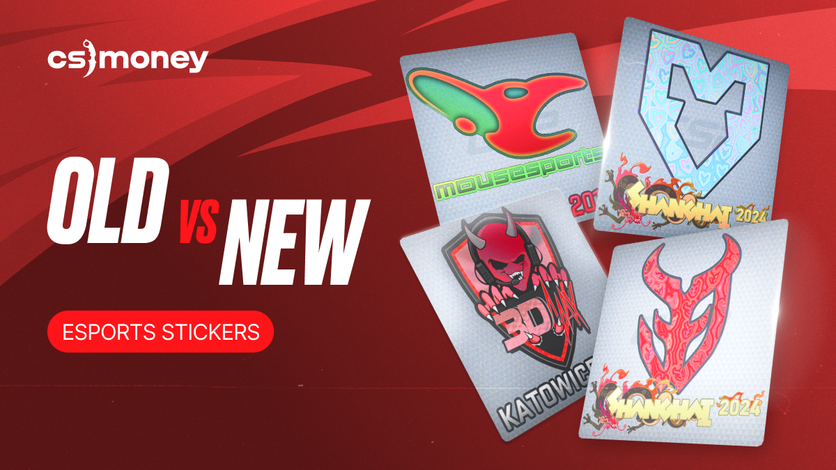
However, today, we’re focusing on a different aspect of these tournaments. Every Major, except the very first one, has been accompanied by the release of stickers featuring team logos. Today, the CS.MONEY Blog explores how the logos—and consequently the stickers—of the top teams in CS2 have evolved over time.
By the way, the Battle Pass event is in full swing! We’ll have a giant raffle very soon, and you still have an opportunity to join! Click on the banner to learn the details.
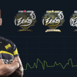
Natus Vincere
When it changed: 2020
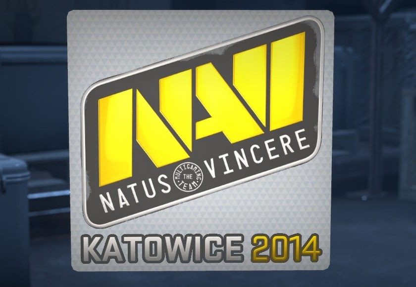
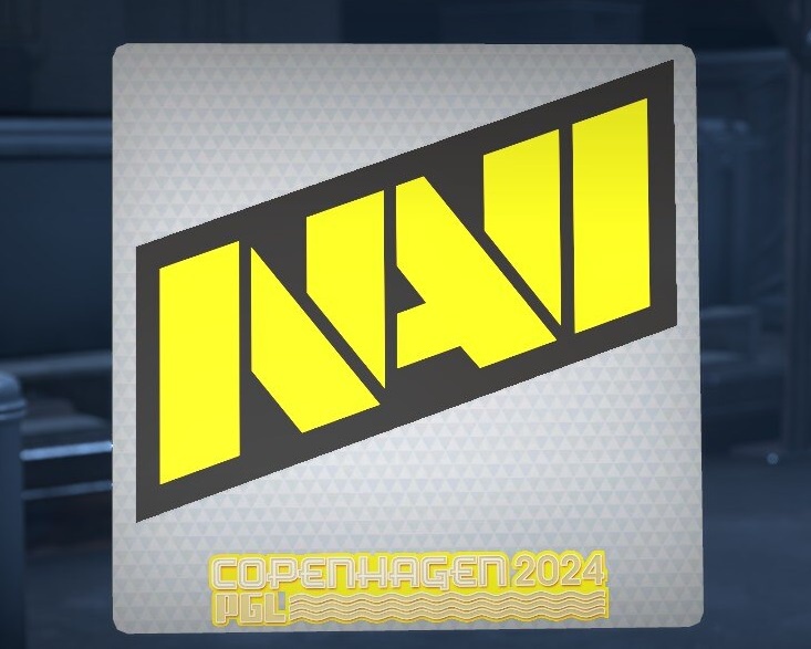
What changed: The old and new logos are quite similar. The new logo features fewer small details and has a more angular design. The text beneath the logo, which previously displayed the team’s full name, was removed.
Virtus.pro
When it changed: 2019
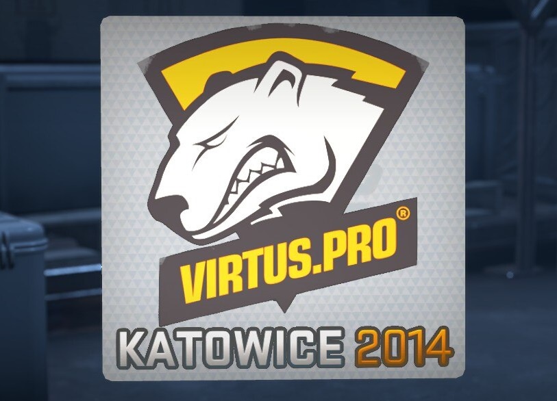
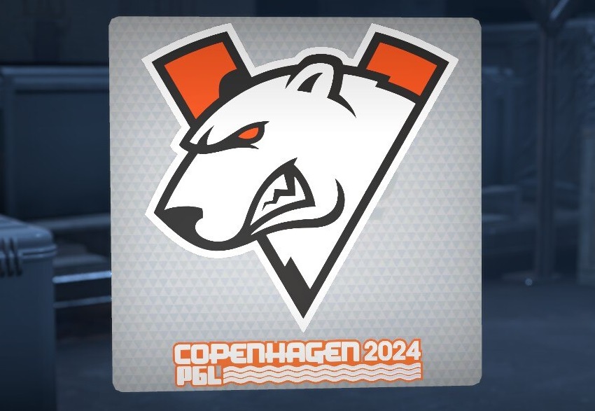
What changed: After 2019, the logo returned to its classic color scheme of orange, black, and white, and the bear mascot lost a few details. Additionally, the logo itself was redesigned to resemble the letter “V,” the first letter of the team’s name.
MOUZ
When it changed: 2021
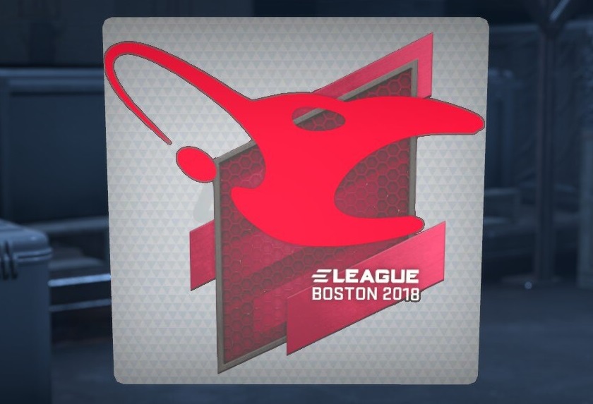
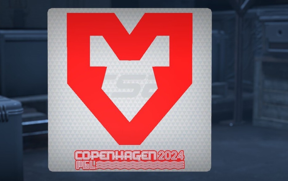
What changed: In short—everything. The old logo featuring a very peculiar-looking mouse was replaced with a sleek, bright red design. The new logo combines the letter “M” with abstract representations of a heart or a mouse head.
Fnatic
When it changed: 2020
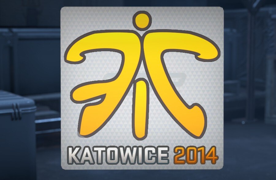
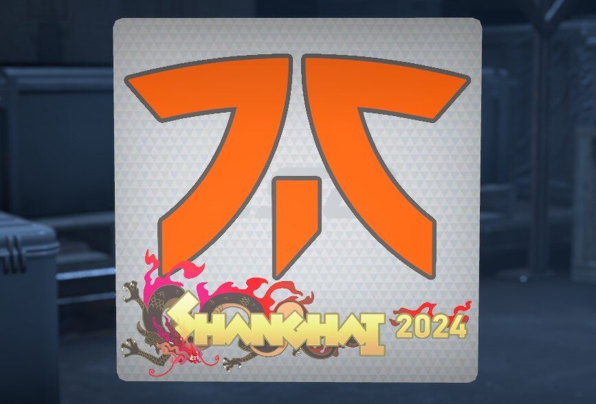
What changed: Fnatic gave its logo a slight modernization. It now has fewer details, sharper angles, and a brighter shade of orange. The font used in the logo hasn’t changed, though it was slightly tweaked during a previous update.
Ninjas in Pyjamas
When it changed: 2020
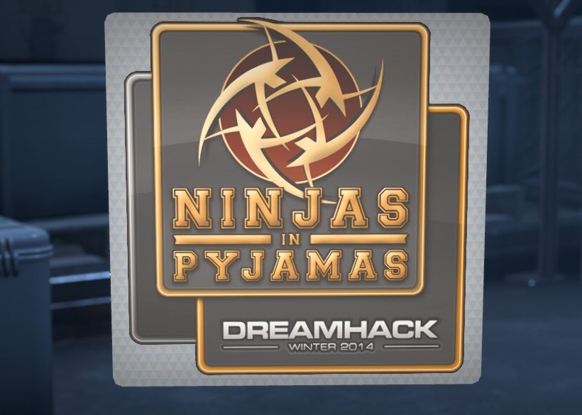
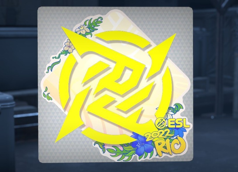
What changed: Before 2020, NiP had already simplified its logo a few times. The latest update removed all rounded edges and added sharp angles. Another significant change was the new color palette, replacing dark beige with bright green.
Complexity Gaming
When it changed: 2019
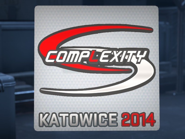
What changed: The team’s old logo resembled a ring made of two elements—red and white. The new logo features a blue star, marking a complete redesign. Interestingly, Jason Lake, the organization’s founder and leader, has mentioned the possibility of returning to the old logo.
Team Spirit
When it changed: 2022
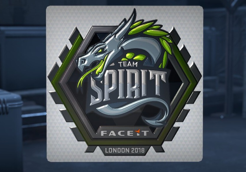
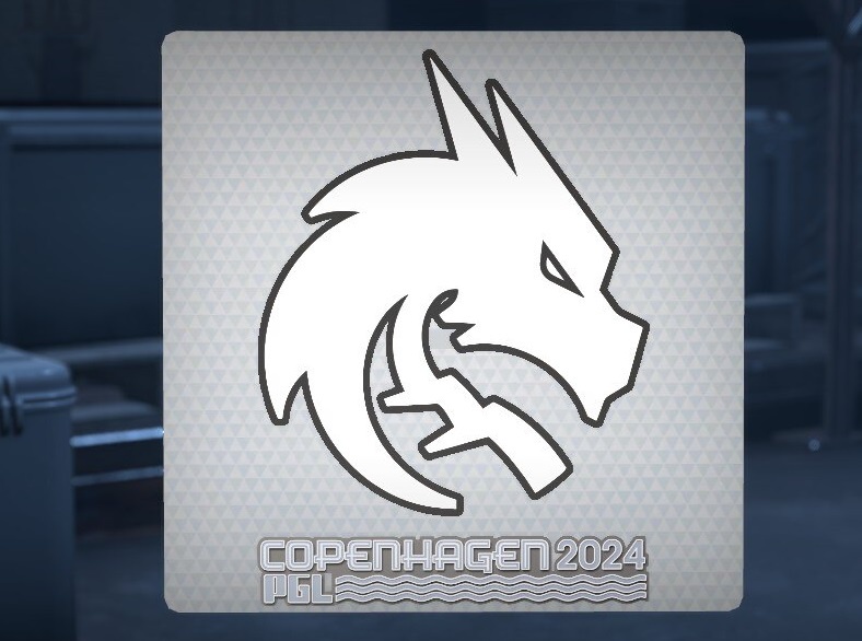
What changed: The latest logo update was a minor cleanup, removing small details. The last major redesign was in 2021, when the dragon mascot was flipped to face the opposite direction, and the background, shadows, and colors were removed. Additionally, the dragon’s mouth was closed to stop it from sticking its tongue out.
Heroic
When it changed: 2023
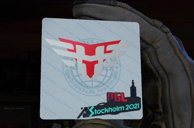
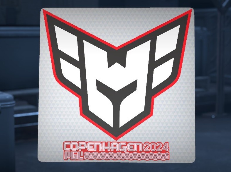
What changed: Like Spirit, Heroic’s latest logo update was a minor cosmetic tweak. Prior to that, the organization had radically changed its logo several times. In 2023, the black outlines of a helmet on a red triangle background were replaced with a white helmet outlined in red.
G2 Esports
When it changed: 2019
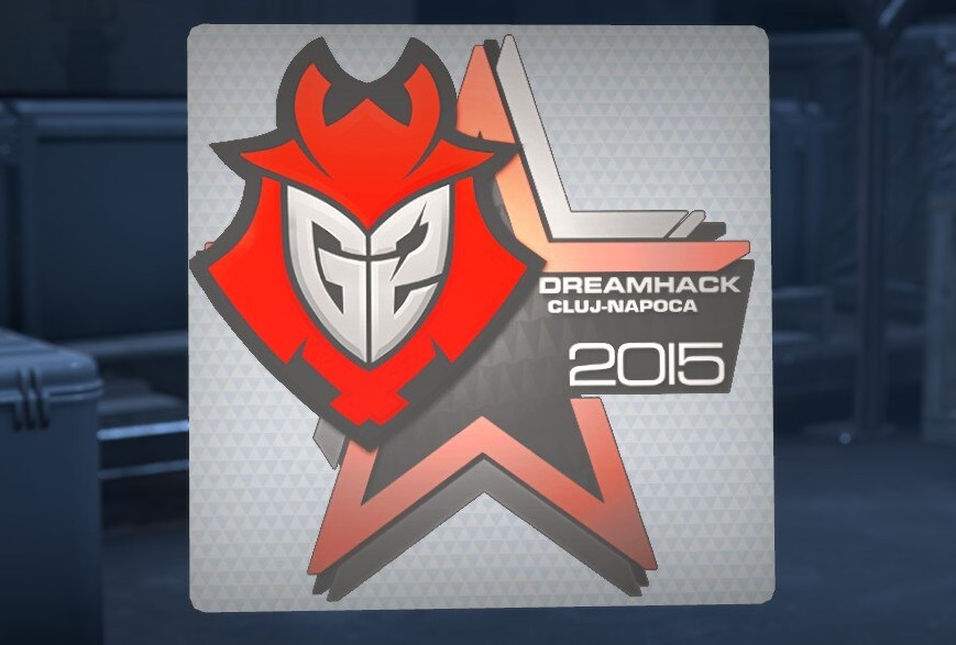
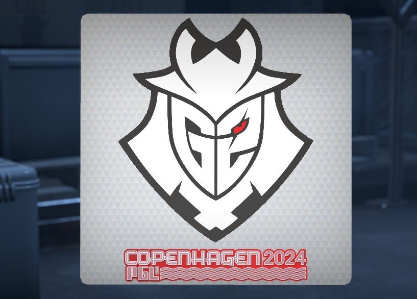
What changed: In 2019, G2’s logo got rid of dark tones and shadows, and one of the samurai’s eyes was colored red. Interestingly, the team’s logo has been recolored in the French flag’s colors several times on stickers, and earlier, the samurai’s helmet was simply painted red.
Oh, and here is your code for Battle Pass: R3EYTLQ5
FaZe Clan
When it changed: 2024
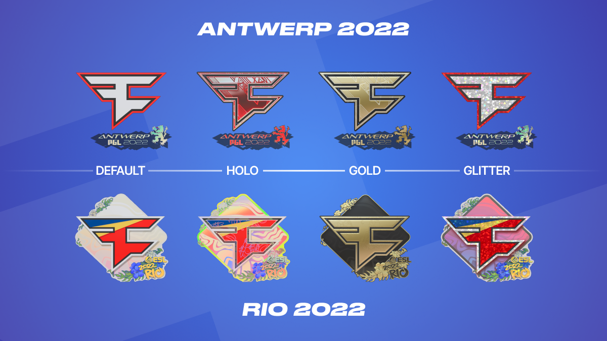
What changed: The colors. The colors. The colors. FaZe Clan frequently changes its logo’s color scheme, but the shape of the distinctive “F” remains the same. The colors have shifted from a tricolor of yellow-red-blue to light red, then plain red, then a tomato red, and now red with a white outline.
HellRaisers (honourable mention)
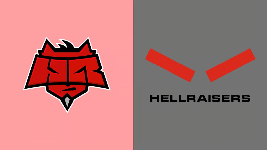
Wrapping up the overview of old and new logos, we can’t skip HellRaisers. Perhaps the most radical rebranding, it never made it to Major stickers. The iconic devil logo featuring the letters “H” and “R” was replaced by two… red rectangles. It’s really interesting to imagine how that logo might have looked on stickers!


