August 21, 2012, is the date of Counter-Strike: Global Offensive’s official release. It’s hard to believe that a decade-old game is still the world’s leading esports discipline and doesn’t look like something ancient. Moreover, in a recent post, the developers said they expect at least another ten years of support. Isn’t that amazing?
But well, why does CS:GO have to look ancient? Because originally, the game was developed simultaneously for PC, XBOX 360, and PS3! That is, not just the last generation, but the one before last. These consoles had their graphic peculiarities if you know what we mean, so CS:GO looked accordingly in 2012.
As a part of CS:GO Anniversary Cycle dedicated to the game’s brithday, here, CS.MONEY Blog will remind you what CS:GO looked like at the time of its release and compare that game with what we have today.
Interface
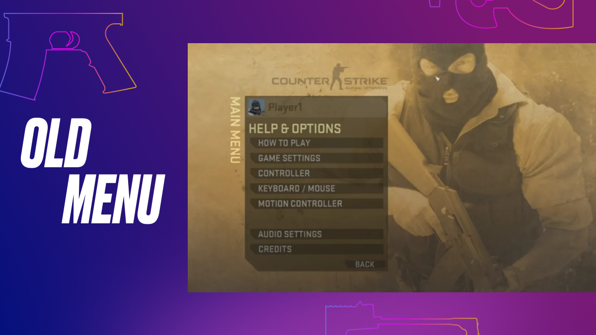
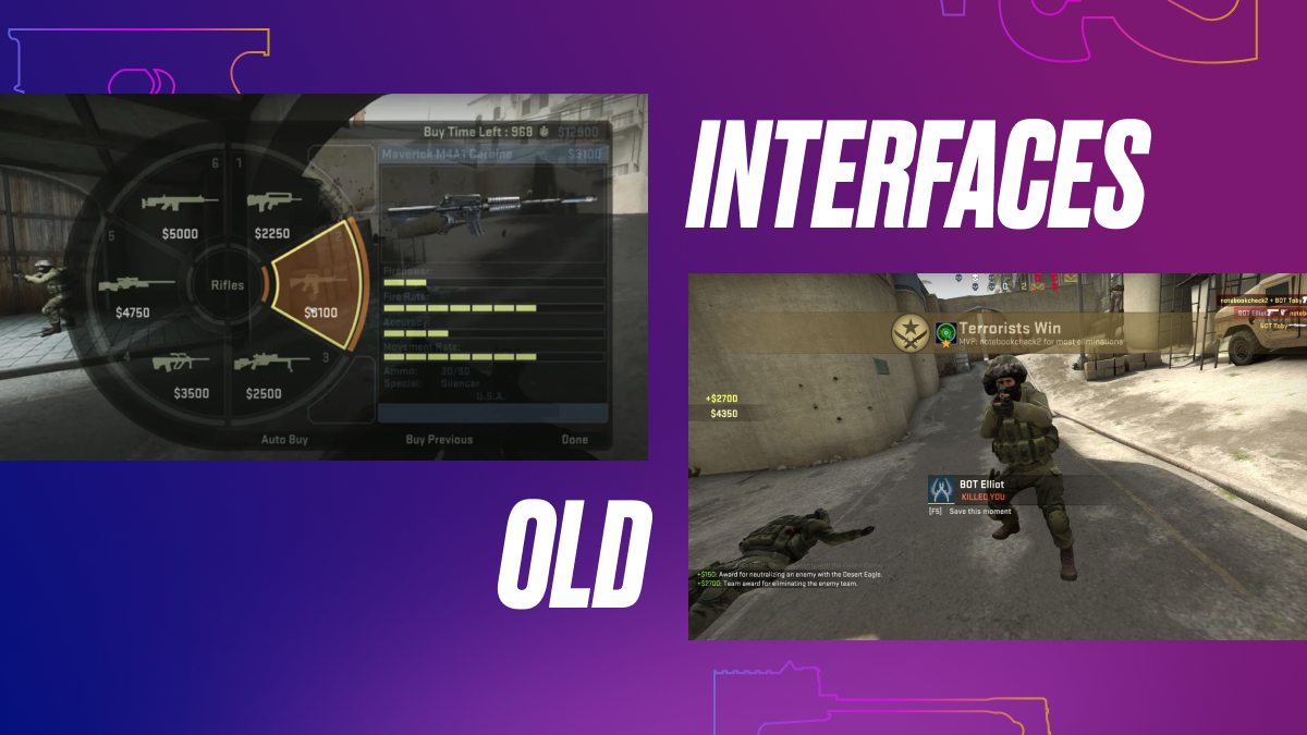
First of all, when players entered the game in 2012, they saw a rather concise menu resembling the older versions of CS. At first, it was faded yellow, and then it was changed to blue:
In addition, the menu for buying weapons and equipment looked like this. Radial menus were invented for console controllers!
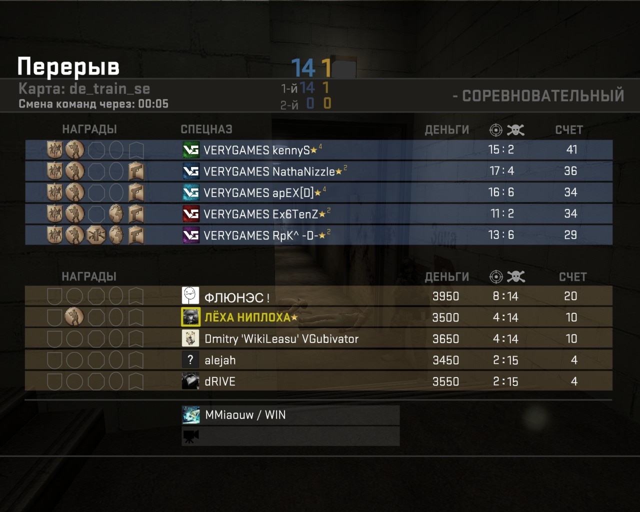
And this is what the table looked like at one of the first CS:GO tournaments in 2012. A couple of familiar faces:
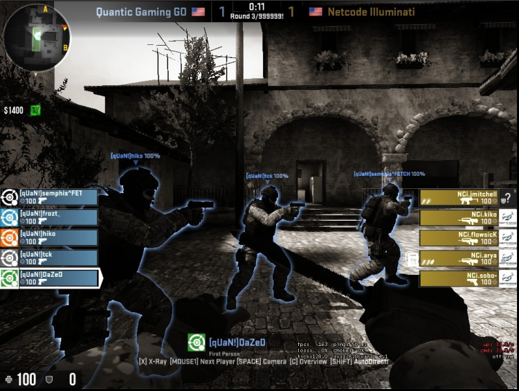
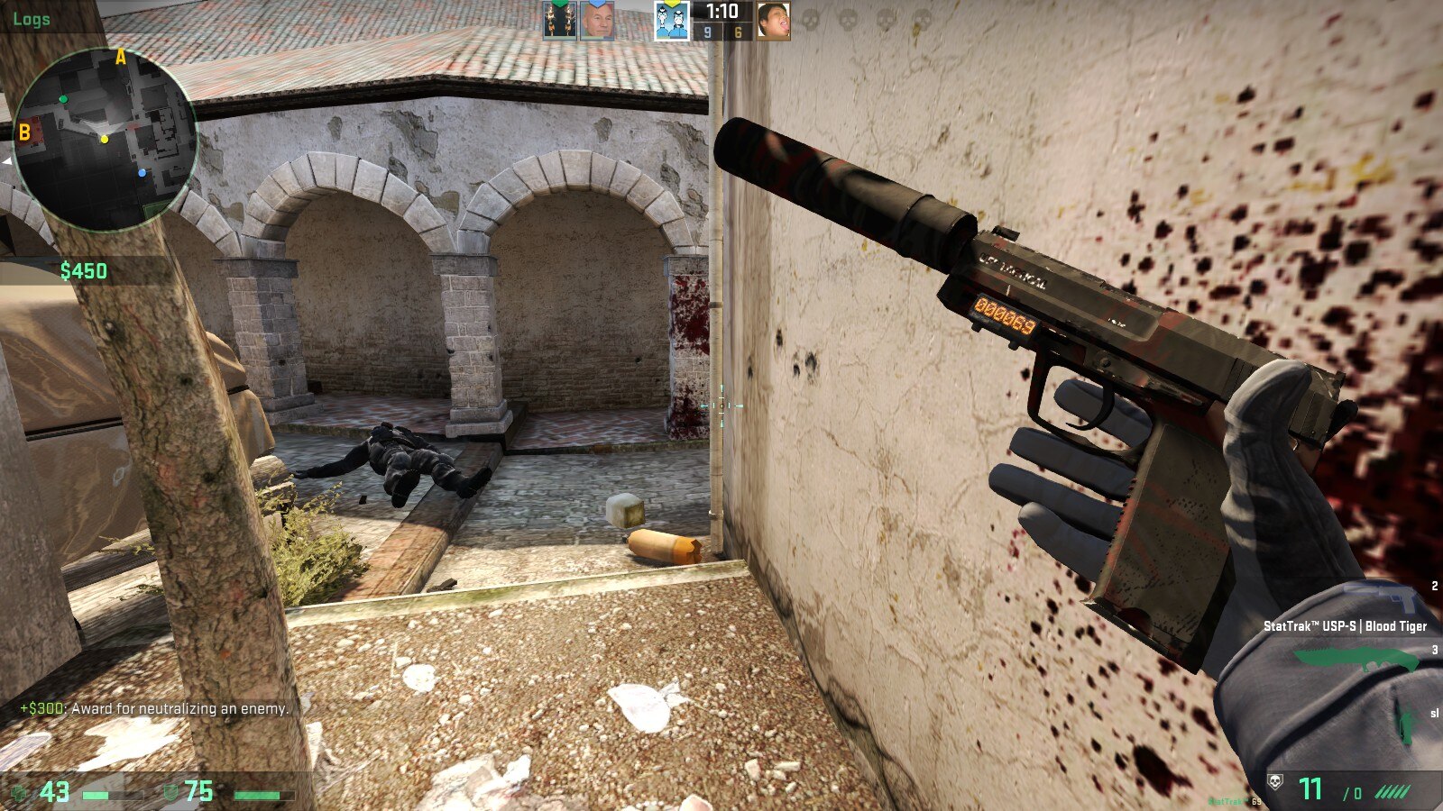
Here’s some more esports stuff from 2012. See how littered the screen is on all sides?
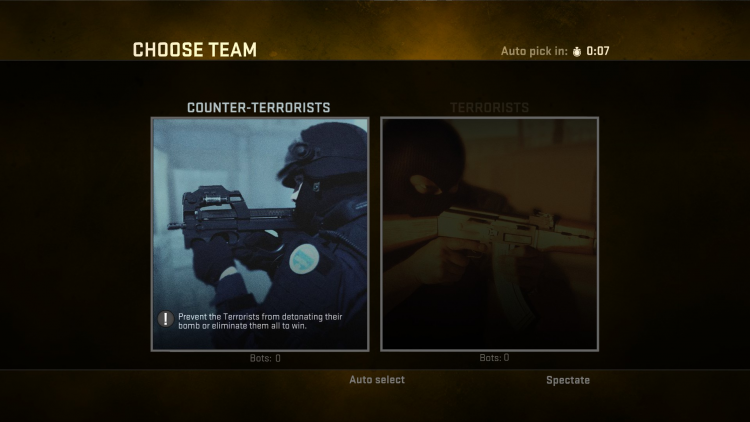
Picking sides:
Today CS:GO looks much more convenient and more straightforward. Yes, beginners could get a little confused in the main menu, but after a few launches, everything becomes extremely clear and understandable. The matches have nothing excessive; the interface is convenient and minimalistic. The progress is apparent, and it pleases.
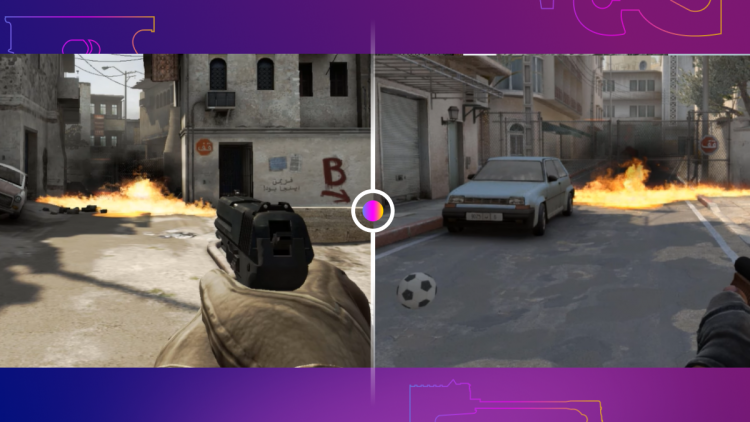
Maps
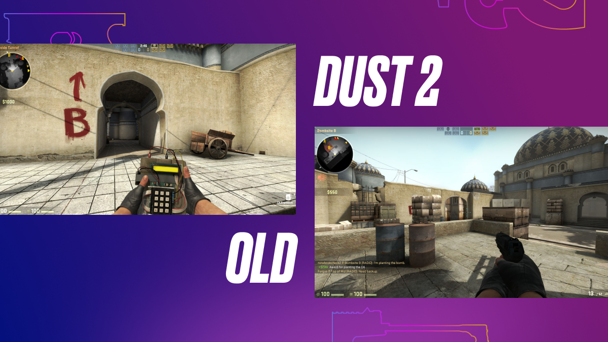
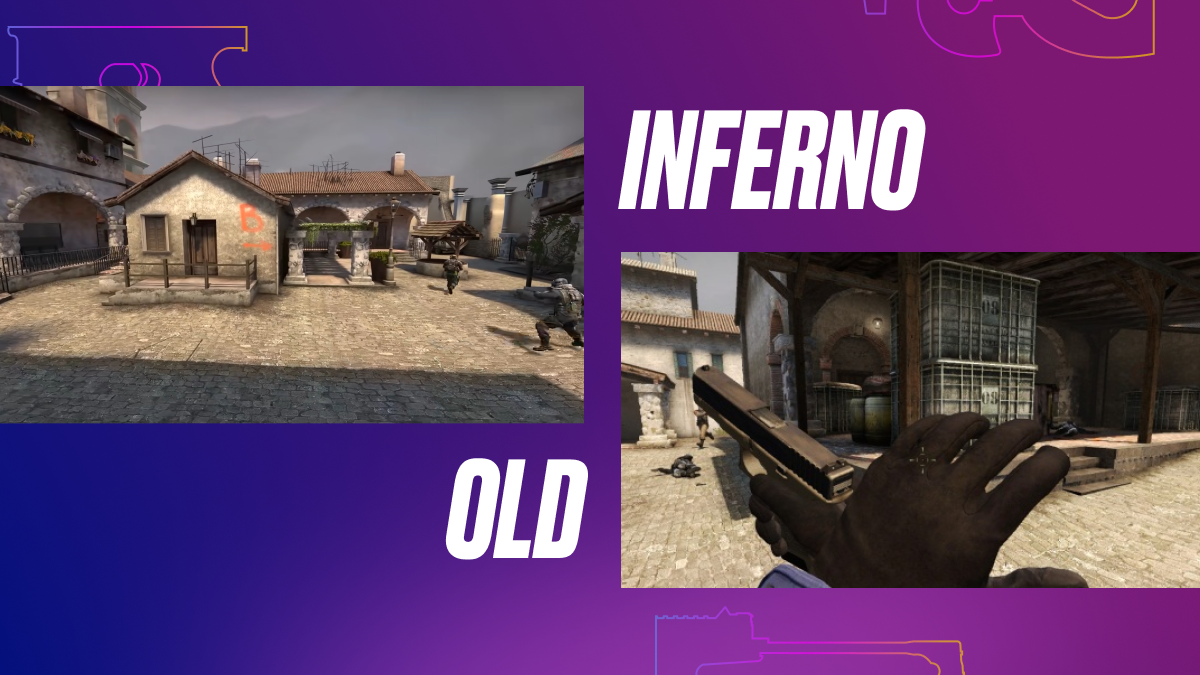
It’s pretty interesting with maps. If you look at the video reviews of the very first versions of CS:GO in general, only Dust 2 and Mirage will visually resemble their current versions. Yet, Dust 2 was tweaked in terms of colors and items, while Mirage is about to retire (we hope).
And that’s no wonder because Mirage is one of the most ancient maps in the current professional map pool. Even though it went through a few minor revisions to improve the competitive aspect, this is the only map that hasn’t changed at all in terms of graphics and design.
In general, even skinmakers note that in recent years CS:GO has begun to move away from gloomy and dark colors in favor of brighter palettes. This is also noticeable in the latest map updates: sunny and colorful Vertigo and Tuscan are introduced, while the darker Train and Cache are not making it back, no matter how the community begs. Even Ancient looks much fresher and brighter than the once-competitive Aztec, where the atmosphere of the swamp and rain of the depths of South America made it difficult to view skins, oh, uh, we meant character models.
But Nuke, for example, has changed a lot: look at this pale shade, like a nook from Left 4 Dead, just with the horror movie filter turned off. But, see, the devil’s in the details.
Super minimalistic Dust 2:
While Inferno had too many shaders to play with comfort:
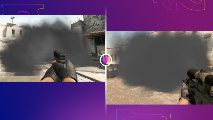
In the past, CS:GO almost forcibly applied many blur effects to smooth out weak graphics, even for those times. Many reviewers and players were not happy with what they saw and felt. By the way, we made a compilation with a whole bunch of quotes from professional players who had just touched the fresh CS:GO when it was released. A lot of interesting stuff, highly recommended!
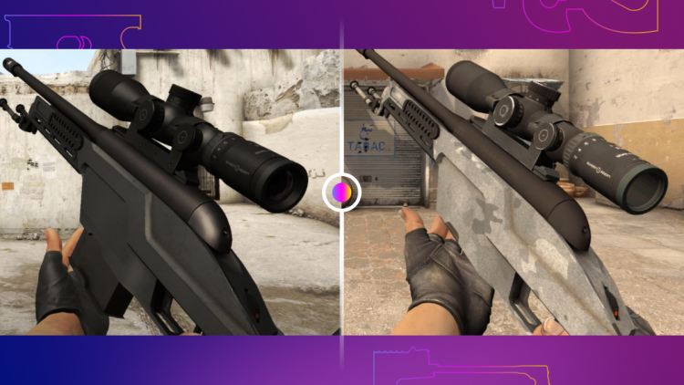
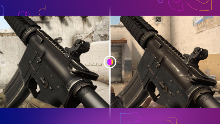
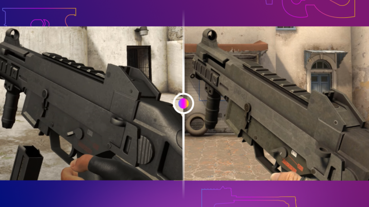
Weapon models
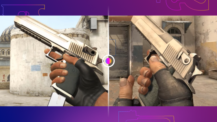
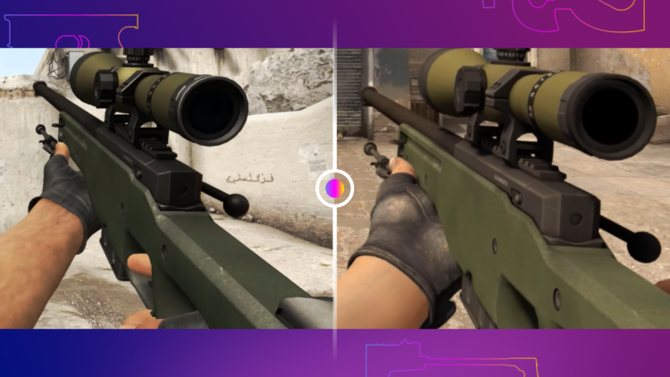
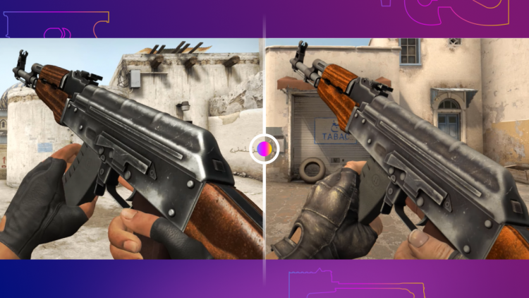
It’s funny that some weapon models have improved over time to a large extent, and some have hardly been touched. Scout is one of the first: Valve changed it severely. At the same time, AWP has not been updated much, like the AK, with just a couple of slight fixes to keep up with the current HQ textures.
Here’s how weapons in CS:GO looked 2012 v 2022.
It’s better now, but more changes will come
Indeed, looking at screenshots of a ten-year-old game that was also designed for ancient consoles (PS4 and XBOX One were released a year later), it becomes clear why the graphics of those times now feel unusually repulsive.
Today CS:GO looks more natural and fresh, although the game lost some ultra-realistic visual solutions: no more glossy metal weapons, no more horror-ish atmospheres on some maps due to dark filters. On the other hand, such realism is not really needed for an esports shooter. In addition, according to what skinmakers say, it is now much more difficult to make a realistic coloring for weapons due to the game engine’s limitations and, accordingly, its tools. For example, switching to Source 2 would bring PBR texturing, making life easier for all skin creators.
Valve is aware that bright and provocative skins appeal to the community much more than close-to-natural or gloomy models. So most likely have an even greater bias towards the primary colors palette without any filters but within the frames of an already given design. A great example is the recent Tuscan, which, by the way, is written in a separate article here. Most likely, Valve will send Mirage and Train for visual rethinking in the coming years (with the latter to be probably under the works already).
Did the changes strike you? Maybe we forgot to mention something else? Comments are open for discussion!
P.S. Special thanks to Reddit users for the screenshots!